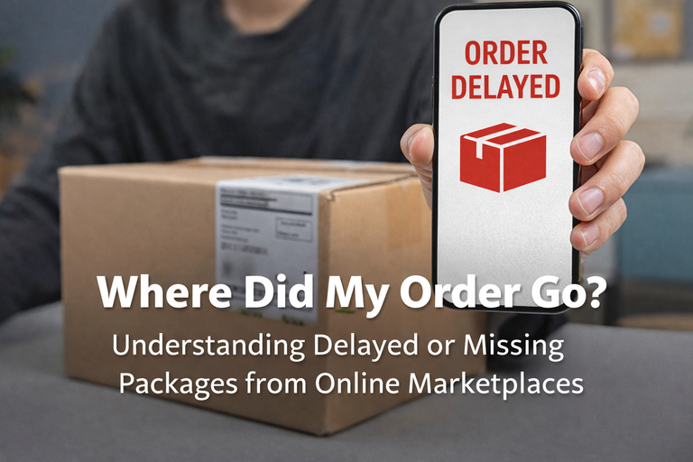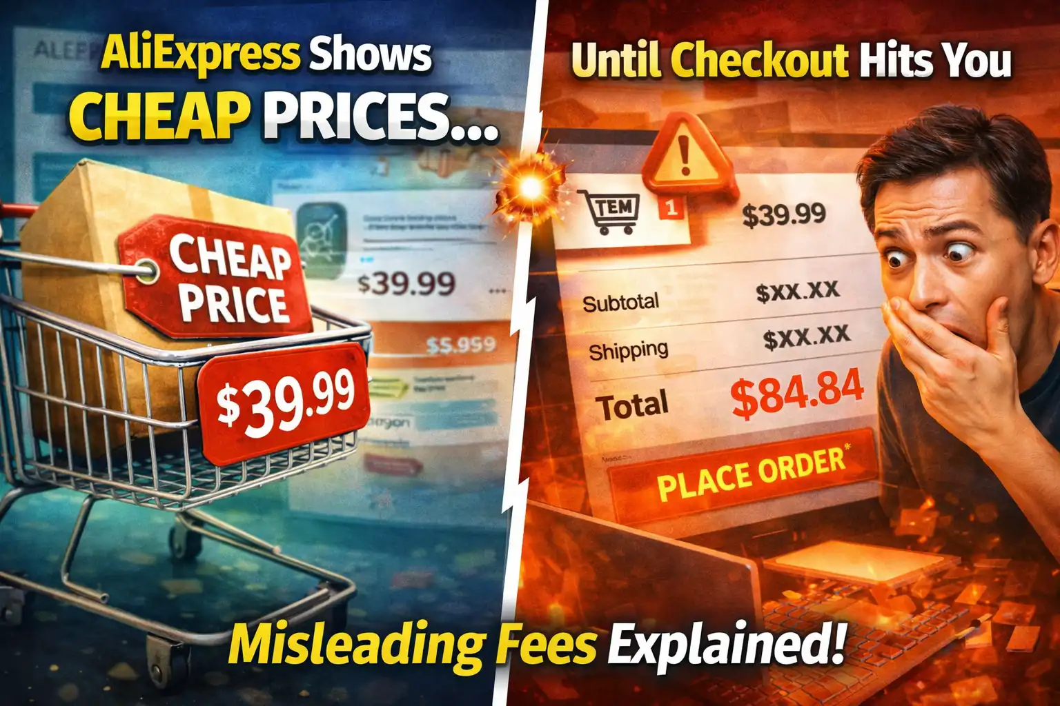
You scroll, you find something interesting, and the price looks almost too good to be real.
For a moment, it feels like you’ve found a hidden deal.
Then you tap “Add to Cart”… and suddenly the number changes.
Not slightly.
Sometimes noticeably.
And now you’re thinking:
“Wait… this is not the price I saw.”
At the same time, you’re squinting at the screen because the text feels too small, you try zooming, adjusting settings, even playing with the search bar — but nothing really changes.
That combination — confusing pricing and uncomfortable UI — is exactly where many people start to feel like the app is working against them, not with them.
The Price You Saw Was Real… But Not Complete
This is the part that frustrates most people, because technically the platform isn’t “lying” — but it’s also not being fully transparent in the way users expect.
What you see first is often the lowest possible entry price, not the final price you’ll actually pay.
That price can depend on multiple hidden conditions:
- the cheapest variant of the product
- the smallest size or lowest specification
- a limited-time promotional tier
- or even a specific seller configuration
So what you’re really seeing is:
👉 “starting from this price”, not “this is the price”
And unless you already understand that behavior, it feels like the system just changed the rules on you mid-process.
Where the Price Actually Changes (And Why It Happens in the Cart)
The real shift usually happens when the system moves from display mode to calculation mode.
On the product page, the system is trying to attract attention.
In the cart, the system is trying to finalize reality.
That’s when several layers activate at once:
- the exact variant you selected
- the actual shipping method available to your location
- applicable (or non-applicable) discounts
- tax or regional adjustments
This is why the number changes — not because it’s random, but because the system is finally assembling the full transaction.
A simple way to understand it:
The product page shows the “idea” of the price.
The cart shows the “commitment” price.
The Variant Trap Most People Don’t Notice
Here’s something that quietly causes a lot of confusion.
Many listings are structured like this:
- Version A → cheapest
- Version B → slightly higher
- Version C → significantly higher
But the product page highlights Version A.
The moment you choose the one you actually want, the price updates.
This isn’t always obvious, especially when the differences are subtle — like storage size, bundle inclusion, or material quality.
So from a user perspective, it feels like:
“The price changed.”
But from the system perspective:
“You selected a different configuration.”
Shipping — The Silent Price Multiplier
Another big factor that only becomes visible later is shipping.
Some listings show:
- low product price
- but shipping added later
Others show:
- higher product price
- but “free shipping”
The problem is, the system doesn’t always make this clear upfront.
So when you reach the cart and see the total increase, it feels like something was hidden — even though technically it was just deferred.
Why Discounts Seem to Disappear
This part confuses even experienced users sometimes.
You might see:
- a discounted price
- a coupon applied
- coins reducing the cost
But once in the cart:
👉 some of those benefits vanish
That usually happens because discounts are conditional.
They may require:
- a minimum order value
- a specific seller
- a certain variant
- or even a region-based eligibility
If your final selection doesn’t meet those conditions, the system quietly removes the discount.
Now Let’s Talk About the Screen Problem (This One Is Real)
The second issue you mentioned — not being able to zoom or enlarge text — is not your fault.
It’s actually a design limitation of the app itself.
AliExpress uses a fixed UI scaling system, which means:
- text size is controlled internally
- pinch-to-zoom is limited or disabled
- system accessibility settings are only partially respected
So even if your phone supports zooming or larger fonts, the app may override that behavior.
Why This Feels Worse Than It Should
Because the app is dense.
It tries to fit:
- product images
- prices
- discounts
- ratings
- shipping info
all into one screen.
And when the font is small and non-adjustable, your brain has to work harder just to process basic information.
That’s where the frustration builds — not from one issue, but from stacked friction.
A Simple Analogy That Ties Everything Together
Imagine walking into a store where:
- the price tag shows the cheapest version
- the real price appears only at checkout
- and all labels are printed in small font you can’t enlarge
Even if nothing is technically “wrong,” the experience feels uncomfortable.
That’s exactly what’s happening here.
What Experienced Buyers Do (Without Realizing It)
Over time, people adapt to this system.
They:
- never trust the first price
- always check the cart before deciding
- compare multiple listings
- and sometimes switch to desktop for better readability
Not because they were taught — but because they learned the system through repetition.
One More Thing Most People Don’t Realize
This entire experience comes from a single design philosophy:
👉 flexibility over simplicity
The platform is built to handle:
- millions of products
- multiple configurations
- dynamic pricing
- global shipping
But the trade-off is:
👉 clarity is not always prioritized
And that’s why new users often feel confused.
If You Want a Smoother Experience
Some users quietly switch to:
- browser version (better zoom & readability)
- larger devices (tablet or desktop)
because the mobile app is optimized for density, not comfort.
If you’re curious about how other buyers navigate these kinds of situations and still find good deals, you can explore patterns and insights here:

Sometimes understanding the system reduces frustration more than any feature update.
Final Thought
This situation leaves a very specific feeling:
“I didn’t do anything wrong… so why does this feel confusing?”
And the answer is simple:
👉 the system is not built to be obvious
👉 it’s built to be flexible
Once you see that, the behavior starts to make sense — even if it’s still frustrating.
Let Me Ask You This
Have you ever added something to cart thinking it was a great deal… only to hesitate once the real price showed up?
And which one bothers you more — the price change, or the fact that you can’t even comfortably read the screen while figuring it out?